


SaaS Dashboard Design Best Practices: What Actually Keeps Users Coming Back
Forrester's 2025 research found that every $1 invested in UX can return up to $100 in revenue for a product, a ratio most founders would take without a second thought. Yet a huge number of SaaS teams still treat the dashboard, the one screen every paying customer opens daily, as an afterthought bolted on after the "real" product is done. That gap between what users expect and what they actually get is where trials quietly die and support tickets pile up.
If you run a software company in Ludhiana or anywhere else building a subscription product, this is worth thirty minutes of your attention. A confusing dashboard doesn't just annoy people, it costs renewals. Most teams that reach out to a website designing company in Ludhiana for a dashboard fix are really describing this exact problem, even if they don't have the vocabulary for it yet.
What Is SaaS Dashboard Design, Really?
At its core, a SaaS dashboard is the control center where users check numbers, manage tasks, and decide what to do next. Good dashboard design is less about making it pretty and more about making decisions fast and obvious. It generally includes:
- Information hierarchy — what's shown first, second, and buried in a menu
- Data visualization choices — charts, tables, cards, and when to use which
- Role-based views — an admin and an end user rarely need the same screen
- Empty and loading states — what a new user sees before there's any data
- Responsiveness across desktop, tablet, and mobile
Why Businesses Choose Custom Dashboard Design Over Templates
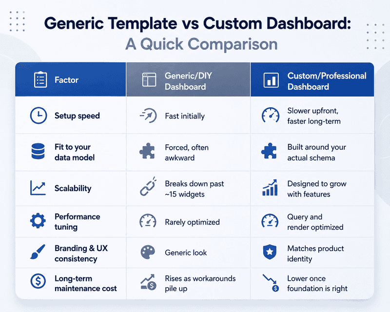
Plenty of SaaS founders start with a free admin template because it's fast. That's fine for an MVP. But as the product matures, the cracks show:
- Faster time-to-value for new users, which directly affects trial-to-paid conversion
- Lower support load because the interface answers questions before users ask them
- Room to reflect your actual data model instead of forcing your product into a generic layout
- Better retention, since users who understand the tool quickly are less likely to churn in week one
- Room to scale the UI as feature count grows without the dashboard turning into clutter
A team offering custom software development can build the dashboard around your actual users' workflows rather than around whatever a template author assumed five years ago. This is really where web designing Ludhiana teams tend to add the most value, not in making things look nicer, but in rethinking the layout around how people actually use the product.
Information Hierarchy and Cognitive Load
Most bad dashboards fail for one boring reason: everything is shouting at once. There's no clear "most important thing," so the user's eyes bounce around and nothing sticks.
- Lead with the 2-3 metrics that actually drive decisions, not everything you can measure
- Use size and position, not colour alone, to signal importance
- Group related data instead of scattering it across the screen
- Progressive disclosure - show summary first, let users drill into detail
- Avoid more than 7-9 distinct data points visible without scrolling
Mittal Technologies Insight: we've seen founders proudly add a dozen charts to prove the product "does a lot." Users don't read a dozen charts. They read three, then leave. Cutting is usually the fix, not adding.
Handling Empty States and Onboarding
A brand-new account with zero data is where a lot of dashboards quietly fall apart. Users see blank charts, assume the product is broken, and close the tab. Getting this right matters more than most teams expect.
- Never show a literally empty widget - explain what will appear there and why
- Use sample or illustrative data so users understand the shape of value before they generate real data
- Add a clear next action, not just a message ("Connect your first data source")
- Keep first-session friction as low as possible; every extra click is a chance to bounce
- Track time-to-first-value as a real metric, not a vanity number
Data Visualization and Performance
Choosing the right chart type sounds trivial until you've watched a user squint at a pie chart with fourteen slices trying to figure out which one matters.
- Match the chart to the question - trends need lines, comparisons need bars, proportions need very few categories
- Keep load times honest; a dashboard that spins for six seconds trains users to distrust the data
- Cache aggressively where data doesn't need to be real-time
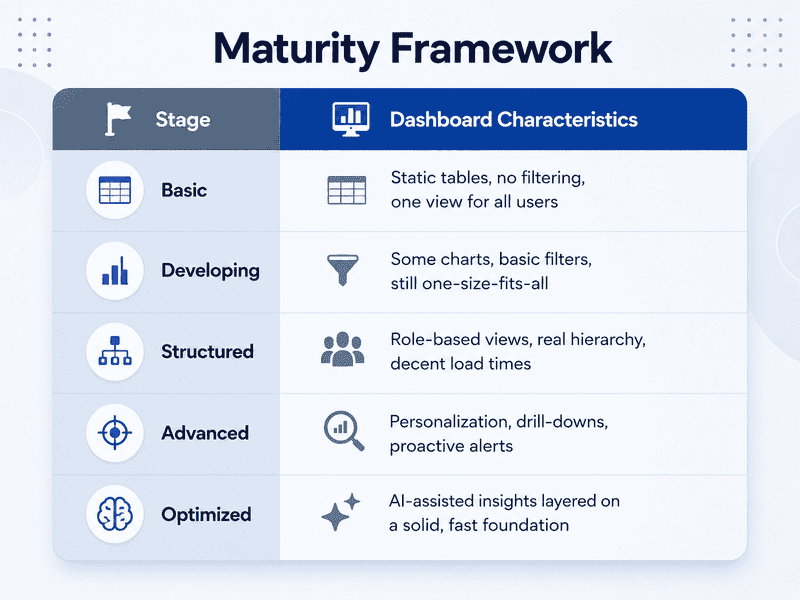
- Design for role-based views so a support agent and a CFO aren't staring at the same cluttered screen
Getting this balance of speed and clarity right is genuinely a byzantine problem, meaning needlessly complicated and hard to untangle, once you're dealing with real-time data, multiple user roles, and mobile constraints simultaneously. It's rarely solved by one clever component; it's solved by a lot of small, deliberate decisions, which is usually why this work sits with a dedicated web design in Ludhiana team rather than being squeezed in as a side task by developers.
How We Approach a Dashboard Redesign
- Audit the current dashboard against real usage data, not assumptions
- Interview or survey actual users about what they check first and what they ignore
- Map the information hierarchy before touching any visual design
- Prototype key screens and test with a small user group
- Build with performance budgets set upfront, not fixed later
- Roll out gradually with a feedback loop, not a big-bang launch
- Monitor adoption metrics for 4-6 weeks post-launch and iterate
Where Teams Get This Wrong
- Overloading the first screen. Best practice: default to summary view, let users opt into detail.
- Ignoring mobile entirely. Best practice: design mobile constraints from day one, not as an afterthought.
- Skipping empty-state design. Best practice: treat the zero-data state as a first-class screen, not a bug.
- Chasing visual trends over clarity. Best practice: pick charts for legibility, not because they look impressive in a pitch deck.
- No performance budget. Best practice: set load-time targets before development starts, not after users complain.
A Word on the Trade-offs
Custom dashboard work isn't free of risk. It takes longer than grabbing a template, and if requirements shift mid-build, rework costs real time. It's worth going custom once your product has enough users or enough data complexity that a generic layout is actively costing you conversions, not on day one of an MVP.
Metrics That Actually Tell You It's Working
Business KPIs: trial-to-paid conversion, time-to-first-value, feature adoption rate, support ticket volume related to "how do I..."
Technical KPIs: dashboard load time, API response time for widgets, error rate on data fetches, mobile bounce rate
Where This Is Heading
- AI-generated summaries sitting above raw charts, explaining what changed and why
- More conversational, chat-style querying layered on top of visual dashboards
- Personalization by role becoming standard rather than a premium feature
- Real-time collaborative dashboards where teams annotate data together
- Continued push toward minimalism, following patterns set by Linear and Notion
Wrapping Up
A dashboard is one of the few screens in your product that gets opened daily, sometimes hourly, which makes it worth the extra planning most teams skip. Get the hierarchy and the first five minutes right, and retention tends to follow on its own. If you're weighing whether to rebuild yours properly, our team has been down this road with a few SaaS products and is happy to talk through what that would actually look like, reach out through our contact page whenever it's useful.
FAQs
1. How long does a custom SaaS dashboard redesign usually take?
Depends on scope, but a focused redesign of core screens typically runs 6-10 weeks including testing.
2. Do we need to rebuild the whole dashboard at once?
No. Most successful redesigns roll out screen by screen, starting with the highest-traffic view.
3. What's the biggest mistake early-stage SaaS teams make with dashboards?
Showing too much data too early, before there's a clear hierarchy of what matters most.
4. Should mobile dashboard design be a separate project?
It shouldn't be separate, but it does need dedicated attention, constraints are different enough that a "shrink the desktop version" approach usually fails.
5. How do we know if our current dashboard is actually a problem?
Look at time-to-first-value and support tickets mentioning confusion. If both are climbing, it's worth an audit.