


What Is Responsive Web Design? Benefits, Examples & Best Practices
Most people don't think about responsive design until something breaks. A customer opens your site on their phone, the menu overlaps the hero image, the text is too small to read without zooming, and they leave before they've even seen what you're offering. That moment when the broken layout, the lost visitor, is the entire reason responsive web design exists as a discipline, not just a buzzword agencies throw around in proposals.
According to StatCounter's global data, mobile devices accounted for 49.36% of worldwide web traffic in August 2026, compared with 49.11% for desktop and 1.54% for tablets. So it's roughly split down the middle now, not the mobile-dominant picture people often assume. Even so, when nearly half your visitors are on a phone, responsive design stops being a visual preference and becomes a basic requirement for a site that actually works for the people using it.
What Is Responsive Web Design, Really?
Responsive web design is an approach where a website automatically adjusts its layout, images, and navigation depending on the screen it's being viewed on — phone, tablet, laptop, whatever the visitor happens to have in hand. One codebase, one set of content, presented differently based on the device.
What it typically involves:
- Fluid grids that resize proportionally rather than relying on fixed pixel widths
- Images that scale without stretching or spilling out of their container
- Media queries that shift the layout at defined screen-size breakpoints
- Navigation built for touch on smaller screens, not just mouse clicks
- The same content and branding, no matter which device someone's on
Responsive Web Design vs Mobile-First Design
People mix these two up constantly, and honestly, it's easy to see why. Responsive design is about how a layout behaves once it's built. Mobile-first design is about where the build actually starts.
- You can technically build desktop-first and scale down, but that tends to create compromises once you hit smaller screens
- Mobile-first flips that — you start with the smallest screen and work up, deciding what matters most before layering in complexity for bigger viewports
- In practice, the two work best paired together: mobile-first thinking shaping a structure that's genuinely responsive, rather than treating either one as a substitute for the other
Why Businesses Invest in Responsive Website Design
The reasoning tends to repeat across industries, which says something about how baseline this has become.
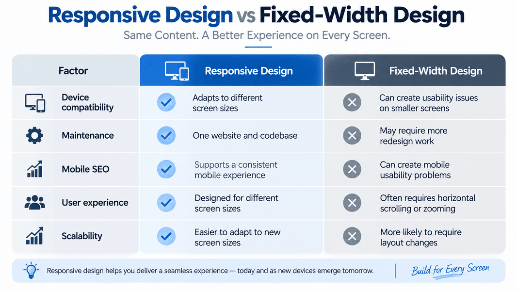
- One site to maintain instead of juggling separate desktop and mobile versions
- A more consistent mobile experience, which matters given how close mobile traffic sits to half of everything online
- Fewer people bouncing off because the layout fought them
- Better overall performance once responsive design is paired with optimized images and scripts
- Room to adapt as new device sizes and screen formats keep showing up
The Technical Building Blocks
A lot of people assume responsive design just means "it looks fine on my phone," but there's actual structure holding that up.
- Fluid grid systems in place of rigid, pixel-locked layouts
- CSS media queries triggering layout changes at set breakpoints
- Relative units like percentages, viewport units, instead of fixed pixel values
- Typography that scales without turning illegible at smaller sizes
- Images compressed and served at resolutions that fit the screen requesting them
Mittal Technologies Insight: Responsiveness and speed have to be tackled together. A layout can pass every breakpoint check and still feel sluggish if the images and scripts underneath weren't optimized alongside the design work itself.
Common Mistakes That Undercut Responsiveness
- Text that shrinks past readable on smaller screens
- Buttons and links crammed too close for comfortable tapping
- Pop-ups or forms that swallow the entire mobile viewport
- Desktop-first layouts squeezed down for mobile as an afterthought, instead of designed for it from the start
- Navigation that demands too much scrolling or tapping just to get where you're going
These are usually why businesses end up bringing in a professional web development team rather than patching things piecemeal — the fixes tend to live at the structural level, not the surface.
Examples of Responsive Web Design
- Navigation: a full desktop menu bar collapses into a compact menu on smaller screens
- Images: a large hero image scales down or swaps to a lighter asset depending on the viewport
- Layouts: a three-column desktop section drops to two columns on tablets, one on mobile
- Typography: headings and body text resize to stay readable without extra effort
- Forms: multi-column desktop forms stack vertically once the screen narrows
Best Practices and Common Challenges
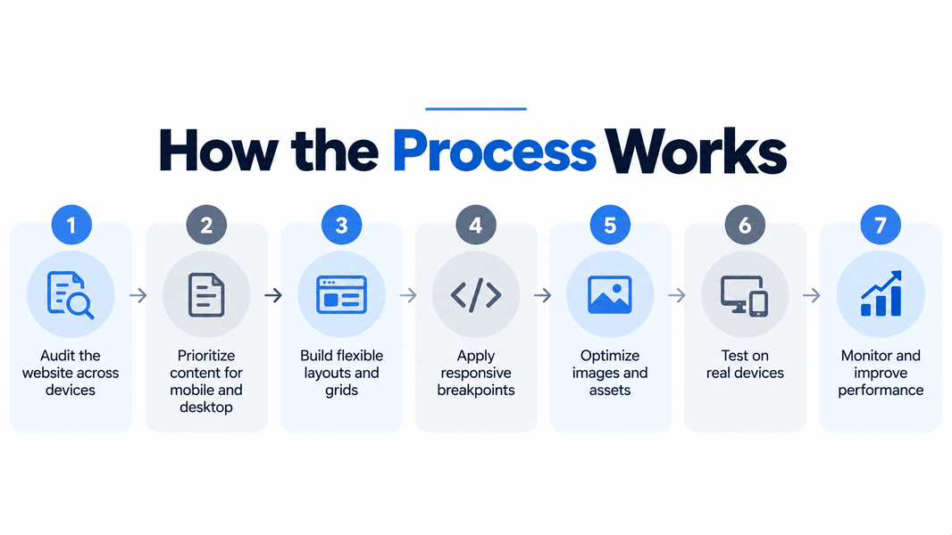
- Slow load times despite a responsive layout — compress images and check for third-party scripts quietly adding weight.
- Testing that skips real devices — a resized browser window isn't the same as an actual phone in someone's hand.
- Content that works on desktop but crowds mobile — write for mobile first, then expand outward.
- Navigation that looks fine but frustrates on touch — give buttons and links enough size and spacing to tap comfortably.
- Templates marketed as responsive without real fluid grids underneath — check the actual CSS instead of taking the theme's word for it.
Where Responsive Design Is Headed
- Container queries are making component-level responsiveness sharper than screen-level breakpoints alone
- Variable fonts are improving how typography scales without adding file weight
- AI-assisted testing is catching breakpoint issues earlier in development
- Voice and gesture input are starting to shape mobile-first design decisions
- Accessibility is becoming a built-in requirement rather than something bolted on later
- Foldable and dual-screen devices are pushing layouts past the old mobile-tablet-desktop split
Final Thought
Responsive design isn't something you tack on at the end of a project anymore — it's the structure everything else gets built around. If your site is still fighting mobile visitors instead of working for them, it's worth having someone take an honest look under the hood. Get in touch if you'd like that second opinion.
FAQs
1. Is responsive web design the same as a mobile-friendly website?
Not quite. A mobile-friendly site is simply usable on mobile, while responsive design specifically means the layout adapts fluidly across screen sizes from one codebase.
2. Does responsive design directly improve search rankings?
Not by itself. Google uses the mobile version of a site for indexing and ranking, so businesses should ensure their mobile pages provide equivalent content and a good user experience. Responsive design is one reliable way to maintain that consistency.
3. How long does converting an existing site to responsive design usually take?
Depends on the site's current structure, but a proper conversion with real device testing usually runs several weeks rather than days.
4. Can I use a responsive theme instead of custom development?
You can, but plenty of themes are only partly responsive. Worth checking the actual CSS rather than trusting the theme's description.
5. What's the difference between responsive and adaptive design?
Responsive design uses flexible layouts that adjust continuously to viewport size. Adaptive design switches between a set of fixed layouts at specific breakpoints, which can feel clunky on unusual screen sizes.